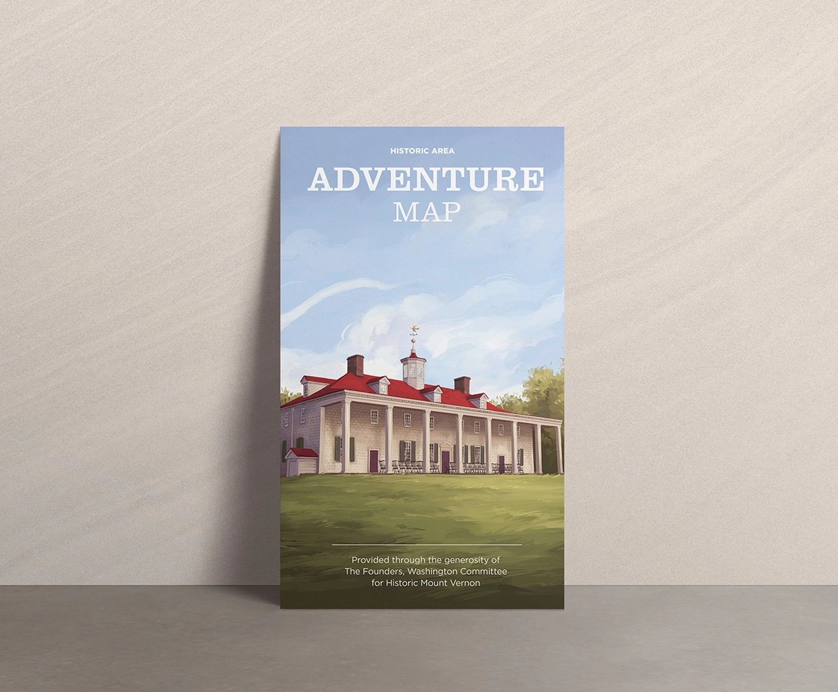
Adventure Map
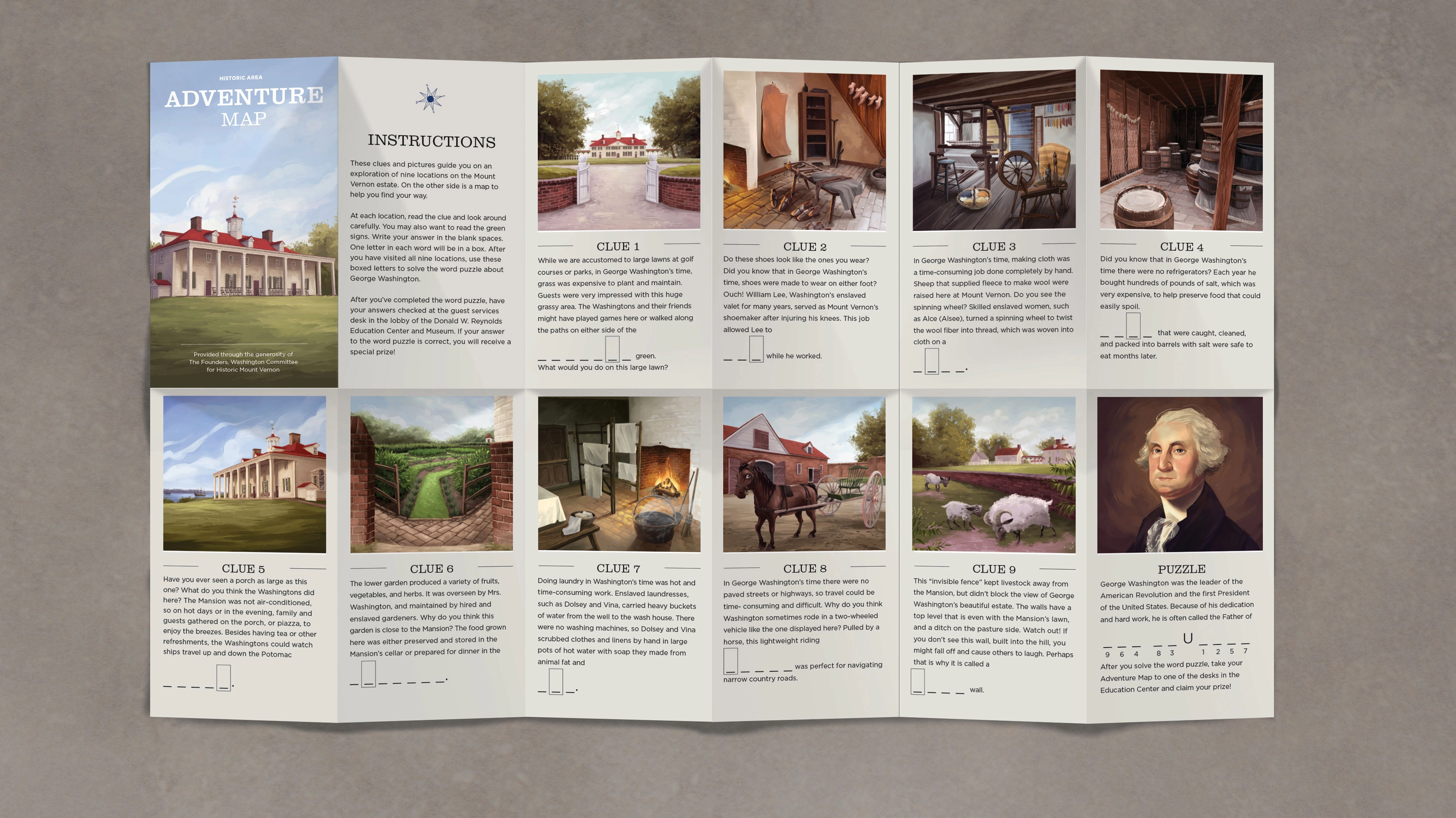
The original adventure map, although featuring entertaining illustrations, was neither modern nor historically accurate. Wayfinding was also particularly difficult with the angular perspective of the map. I was tasked with creating a new, updated version of the adventure while using the same activity format and a similar physical format.
Although the desire was to maintain the same physical format, I made some minor but significant format changes. The overall format is smaller, and the paper stock is heavier. The smaller format is more manageable for children, and the sturdier paper holds up to kids on the go.
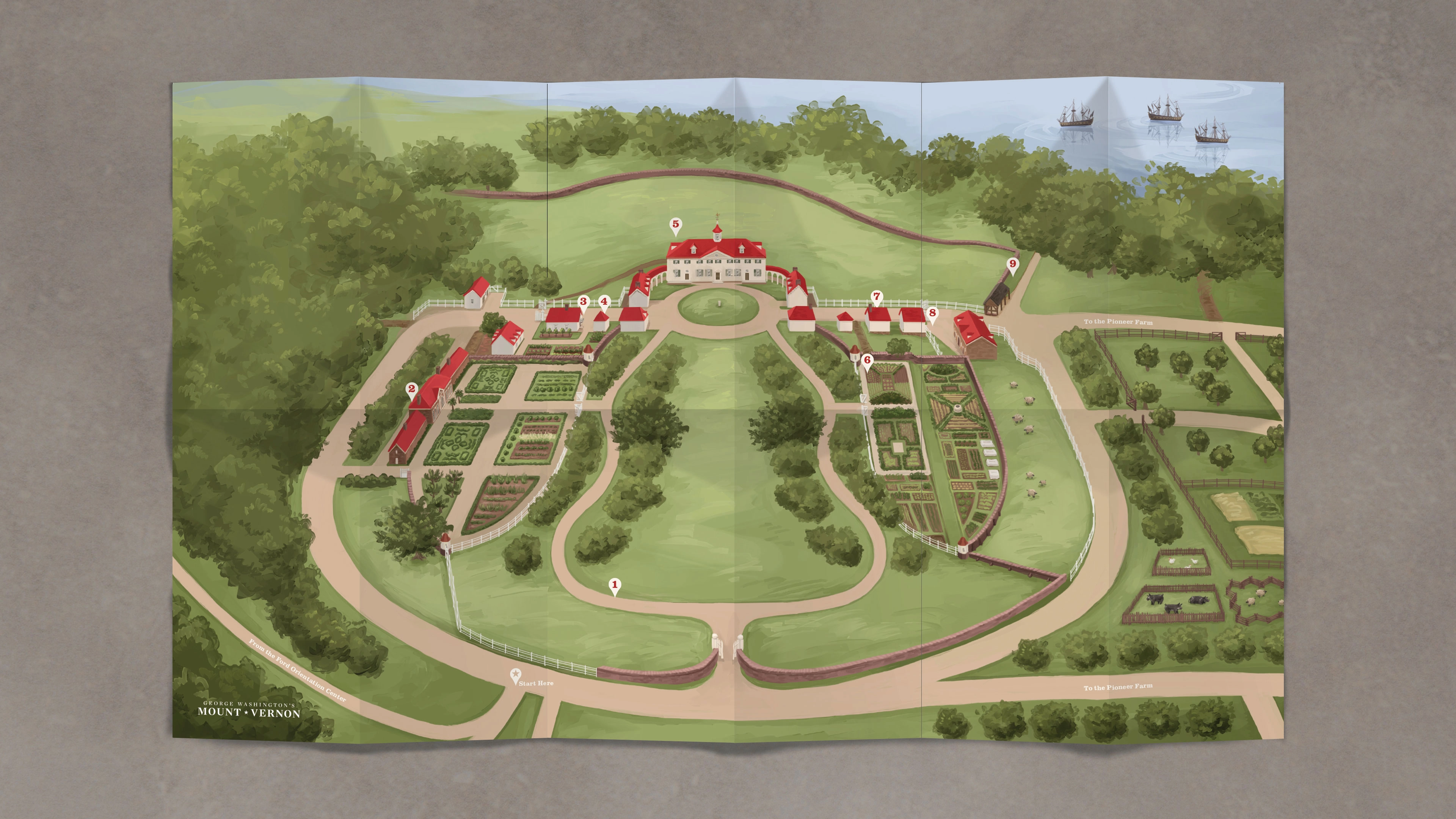
The priority for the map was to make it both engaging and practical for wayfinding. Through testing of multiple pre-existing maps, it was regularly noted that users had difficulty finding their way. So tree lines were pulled away from walkways to make pathways more obvious and the many gates across the estate were added to the illustration as a visual cue. Modern buildings were pushed out of view while keeping each and every walkway from brick roads to dirt paths. The map strikes a balance between modern-day wayfinding and the historic layout and experience of the estate.
CREDITS
Art Direction & Design: Rebekah Hanover Pettit
Illustration: Rachael Briner

